What is the impact of good branding for sales?
Too many sales reps and executives view brand as a lofty marketing goal that lacks measurable ROI. What they fail to recognize is that brand is the secret sauce customers will line up to buy.
Have you ever seen the outside of an Apple store when the latest iPhone drops? Have you ever eaten off-brand Oreos (out of anything other than necessity)? How many outdoorsy-types do you know who drive something besides a Subaru?
That’s the power of good branding.
A strong brand reflects the values of the business and positions a company as unique within a crowded, competitive landscape. Salespeople sell their company’s unique value proposition, mission, and values as much — if not more — than your products and services. According to McKinsey, B2B companies that understand the power of effective branding outperform weaker competitors by an average of about 20%.
But a brand needs to be built with careful consideration and constantly maintained for its revenue and staying power to be realized by the people who wear and distribute its logo — that’s where sales enablement comes in.
What does sales enablement have to do with branding?
Let’s just put it this way: Branding is the ultimate sales enablement tool.
Branding is where content and messaging connect with the sales process.
Sales teams, and their support systems in enablement and marketing, must carefully consider both aspects because effective branding not only “pushes” your message to your target market, it also “pulls” new prospects into the pipeline.
It’s at this exact point in the customer journey when selling tools such as sales enablement software and other well-rehearsed tactics can speed up pipeline velocity or — just as valuably — slow things down for potential customers to give them time and resources to better understand just what it is that makes your brand worth their time and money.
While branding alone doesn’t make a complete sales enablement strategy, it’s hard not to see how it bleeds into the other moving pieces involved in the process — everything from learning materials, coaching sessions, social selling, and more.
Key benefits of building brand for sales and enablement teams
- Establishes a unique identity — Customers recognize and remember you, making it easier (in some cases unnecessary) to differentiate from the competition. Say you want to buy your spouse a new stationary bike for their birthday. Can you name any options off the top of your head that aren’t Peloton?
- Creates customer loyalty — They also turn customers into loyal followers or even advocates who spread the word to others in their network. Let’s stick with the Peloton example. If someone in your life has a Peloton, you definitely know about it. And they’ve probably tried to persuade you to buy one yourself.
- Gains customer trust and builds seller credibility — If a customer is buying from a brand they trust, the seller immediately starts out on the right foot. The customer trusts the brand and so trusts the seller — they don’t suspect any dishonesty or bending of the truth just to close the sale.
- Increases perceived value of the products and pricing — Name brands lead people to make more purchases at higher price points and with less deliberation. Because the brand is so well known, people assume the products are higher quality. You’d pay more for a Peloton than a “stationary bike,” right?
Put succinctly, a strong brand greases the wheels of the sales cycle and makes enabling sales easier.
Using the power of branding for more effective enablement
It’s clear why enablement teams need to enforce branding, but the question is how. To both bring your company’s brand to its full power and use it to your advantage as an enablement leader, your approach should focus on two main areas:
- Controlling and tracking the content used by sales reps to ensure a consistent customer experience
- Immersing your reps in the brand daily with a tailored “homebase” for all-things enablement
Reps ignoring branded and marketing-approved materials and creating their own Frankenstein content is a common phenomenon, but it spells disaster for a brand. In fact, CSO Insights reported that 18.4% of salespeople change or simply make their own content. The fragmented experience it provides customers moving from marketing to sales can very quickly derail a potential sale and erode trust in a company.
Making sure your reps eat, sleep, and breathe your brand through a customized and centralized enablement repository helps cut down on this occurrence since reps will not only know where to find approved content, but will be more likely to replicate it accurately when they do decide to go rogue.
Creating branded enablement solutions with Bigtincan
The key difference between Bigtincan and other standard sales enablement platforms is that Bigtincan is easily custom-tailored to fit your workflow and brand. This customization can easily be done by our team or yours.
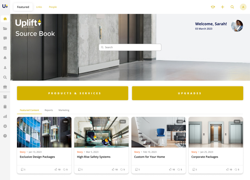
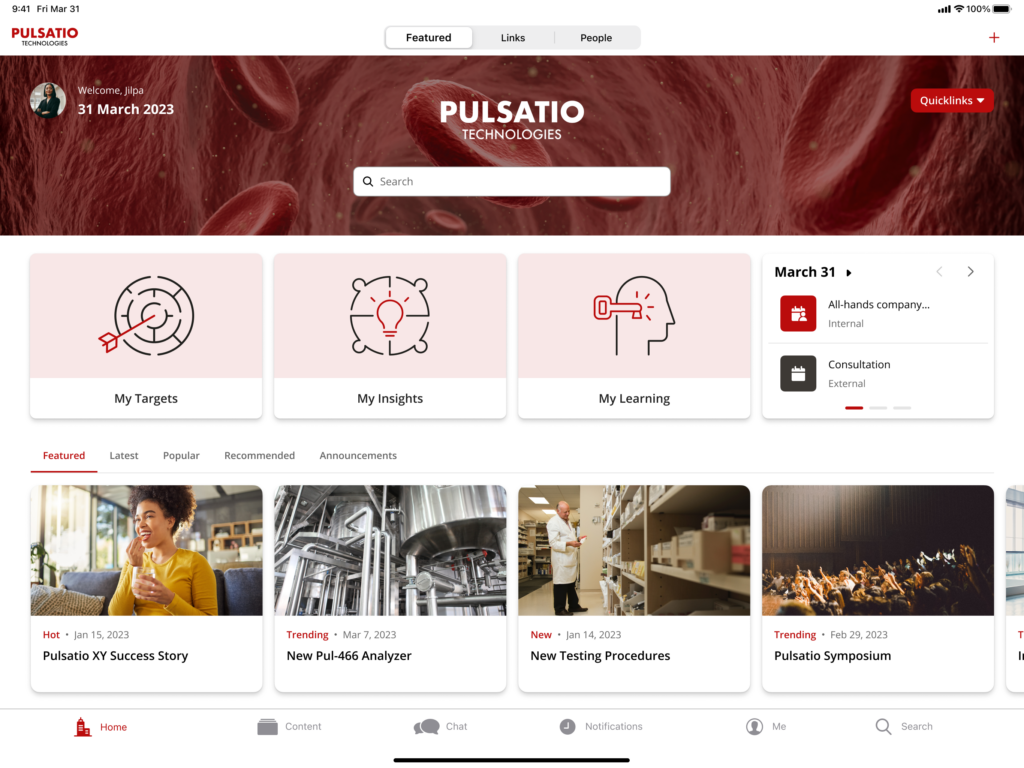
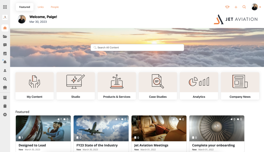
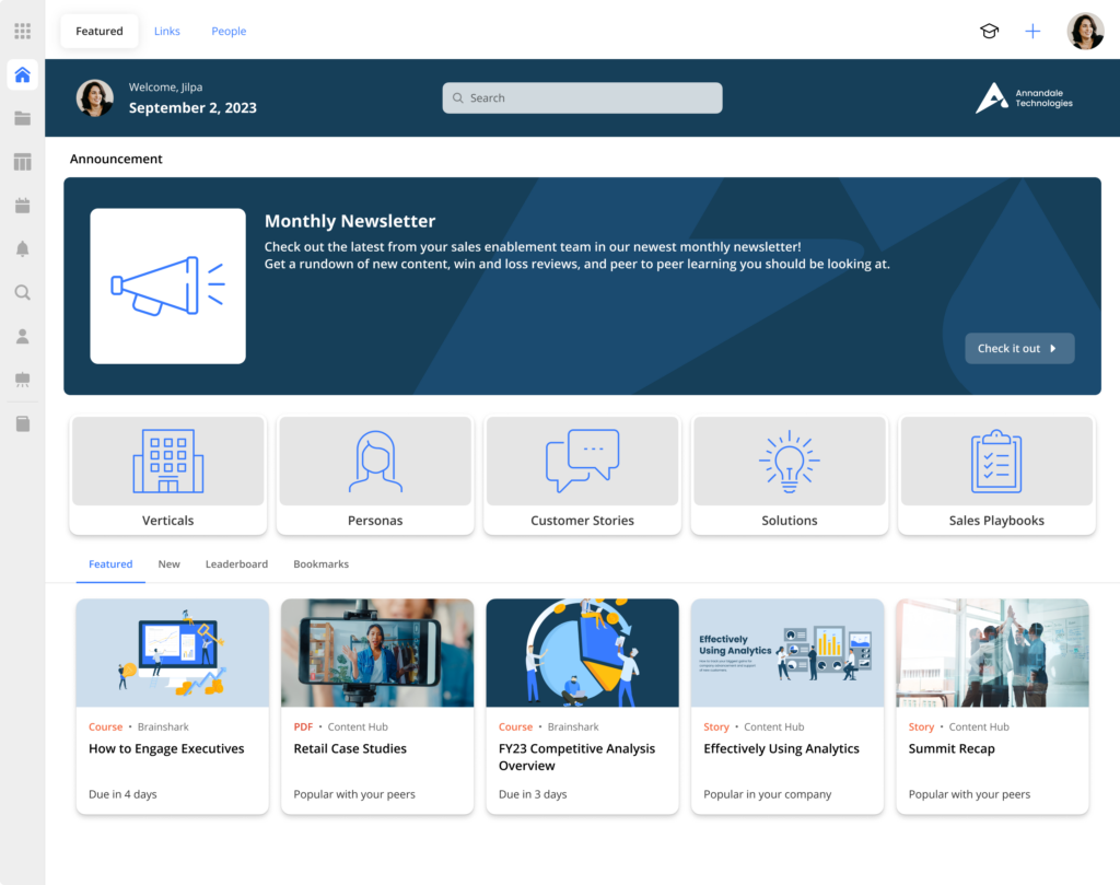
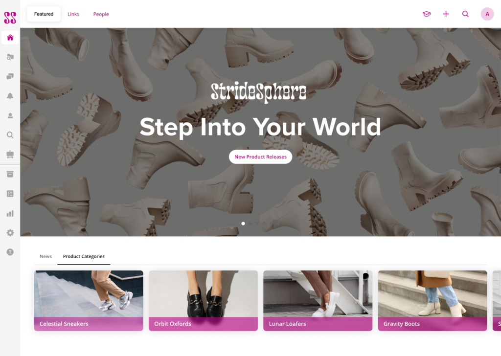
Here are a few examples of branded homescreens for different organizations and industries — each with different styles and functionality.
Example: Custom enablement homescreen for manufacturing reps
Example: Custom enablement homescreen for medtech and pharma reps
Example: Custom enablement homescreen for corporate airline teams
Example: Custom enablement homescreen for B2B tech teams
Example: Custom enablement homescreen for retail teams
In today’s selling environment, the value of branding has never been higher
Treating branding as though it’s the exclusive domain of the marketing team is a big mistake. Your brand’s value depends on the entire organization working together on a holistic level to align toward the same goals and big-picture vision. Bridge the gap between your branded content and your salespeople to create a cohesive experience for new and existing customers alike.
Help your customers meet your brand face-to-face by immersing your sellers in your brand every day.
Get in touch with our team today to learn how our tailored content management platform can help you maintain consistency and control across all channels and in front of customers.
